Why Korea
Medical Korea
Connecting patients with THE BEST MEDICAL SERVICES
-
South Korea’s medical brand combines cutting-edge technology with respect for patient’s healthy
everyday life.
Korea has attracted more than 2.76 million foreign patients as of 2019, since the attraction of
international patients began in 2009.
Among many reasons for the increasing number of patients, there are benefits such as reasonable
medical costs, high quality medical services, short waiting times, and tourism packages combining
relaxation and tourism.
-
- Satisfaction
-
Most Recent Patient
Experience Was Treated with
Dignity and Respect
Global Views on Healthcare
2018 Graphic Report (2018)
-
- JCI accreditation
-
24 Korean hospitals were
accredited by Joint
Commission International
(JCI)
-
- Share & Respect
-
KHIDI’s “Medical Charity Program” has cured more than 400 patients from 28 countries.
(2011-2021)
-
- Cooperation
-
Expansion of International
Cooperation With foreign
government and
organization in healthcare
field
-
- Workforce
-
Highly Qualified Medical
Professionals Although
becoming a medical
specialist requires 11 years
educate, The specialists are
120,630 KOSIS, 2017
-
- Efficiency
-
Korea’s universal medical care ranked 5th most efficient healthcare system
Bloomberg, Most Efficient
Health Care System (2018)
-
- 2020 IMTJ
- IMTJ Outstanding
Response to Covid-19
-
- Social
-
Corporate Social
Responsibility Program
of the Year
Healthcare Asia Medtech
Awards (2021)
MEDICAL KOREA Brand advertisement video
MEDICAL KOREA Brand story
- 1. Brand Goal: Restoring the joy of daily life for those who have lost it due to illnesses
- 2. Brand Vision: Growth as a global medical brand leader for the health of people around the world based on the best medical technology and respect for life
- 3. Brand Essence: Restoration of daily life (Begin again)
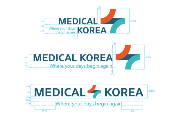
- 4. Brand Name & Slogan: Medical Korea, where your days begin again
- 5. Brand Value: Passion for the best medical technology, a deep understanding of patients' needs, seeking humanitarian values, anticipating the recovery of daily life
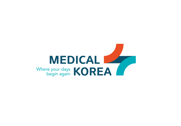
- 1. Symbol: The cross, representing medical services, symbolizes the seamless connection between patients and high-quality healthcare.
- 2. Logotype: The style that harmonizes lines and curves represents the synergy between Korea's advanced medical technology and its welcoming service, illustrating the balance between reason and empathy.
- 3. Color: The balanced combination of warm and cold colors metaphorically symbolizes Korea’s Taeguk, displaying the welcoming and kind service spirit and the accurate and scientific medical technology.
